Similar Projects
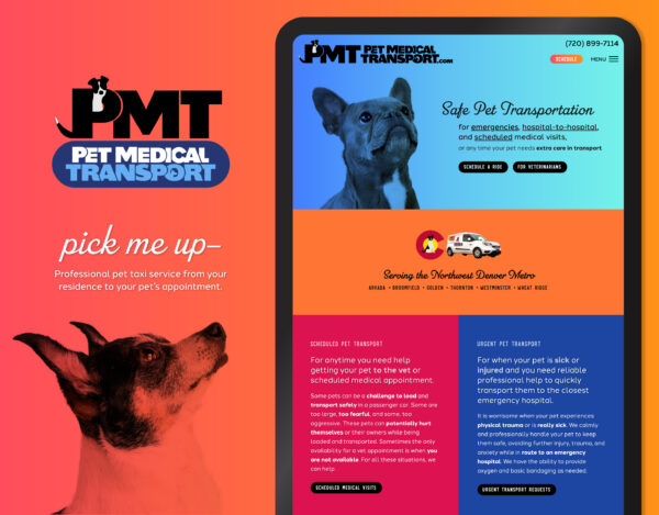
Pet Taxi Branding and Website
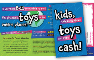
Printed Direct Mail Design

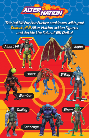
Social Media Advertisement Design
Product Box Enclosure Designs
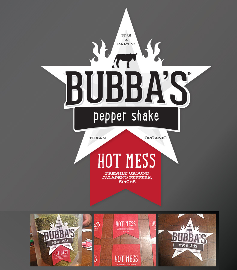
“I want a Texas star, give it some flames, and make it awesome.” This lighthearted logo and product label not only lived up to the client’s request, but went a step further. A strong, manly title is paired with a more rustic, writing-style font for a handmade feel. The coordinating serif for the ingredient list reminds us that we’re back to business with clean eating.
Set on a star background, the logo breaks through the boundaries for visual impact on the product packaging. The semi-nondescript animal is added to keep the mark lighthearted and fun. The spice tags may be printed separately to indicate the level of spiciness – and all are set up to be ink jet printed and cut on demand with the Silhouette Cameo cutter.
Sarah is the best! Great design backed by expert know-how on how to make it all work online!